Product Background
While working at Cambridge Semantics, I was the Lead UX/UI Designer for their new product, Anzo Smart Data Lake (Anzo). Anzo is an enterprise data management platform that allows users to ingest, organize, discover, and analyze disparate datasets in order to form meaningful insights. Previously, Cambridge Semantics had multiple software applications primarily developed for administrative IT staff. Anzo Smart Data Lake was intended as a single unifying product with a focus on business users.
Problem Statement
Internal users were testing our product and became frustrated that they would kick off actions without feedback from the UI on whether the action was queued or in progress. The challenge was: how do we convey errors, progress, and general system feedback to the user?
User Research
I conducted interviews with 3 different internal users to understand their use cases and more specifically:
- Why is it helpful to our users to get notifications from the system?
- When does the user want to know information about long-term actions in the system? What tasks are they trying to complete?
- What errors are they trying to problem solve or troubleshoot? What information do they need to troubleshoot these tasks or problems?
Requirements
- Notify the user that an action has been started or queued immediately after kicking off the action in the UI.
- Allow users to view the status of the latest actions from anywhere in the UI.
- Allow the users to view relevant logs in order to troubleshoot errors.
- Allows users to see all the actions in the system that are in progress, have errors, and have been completed. Allow the user to filter these actions by status, start time, and end time.
- Account for both novice and technical users.
Design


After I compiled our requirements, I looked at examples of other products that have notification systems. I researched the notification systems on Facebook, Twitter, LinkedIn, PatternFly, and Apple products. I came up with three iterations and decided on a design that was most consistent with the rest of the UI and gave more visual flexibility for long status messages.
Testing


I conducted usability tests with our internal users asking them to use a Marvel prototype to kick off a background action in the system and view the progress of the action while I asking the following questions:
- Before kicking off the action, what did he expect would happen?
- What did he expect would happen once he clicked on the notification in the toolbar?
- Did the activity log screen look the way that he expected, why or why not?
- What was the status of the action in the activity log?
- How could he get more information about the status of the action?
- Was there any information that he wishes was on the activity log screen that is currently not there?
While most of the users could navigate through the UI smoothly and the workflow of the design was intuitive, the feedback that I received moving forward was that the images and icons were confusing. The users did not understand why the images next to a completed action were in color, images next to an in-progress actions were in grayscale, and images next to an action with an error were in grayscale with a red icon overlaid.
The Final Design
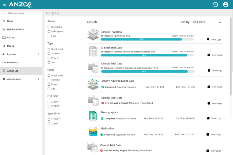
I solved the image/color confusion and inconsistencies by only showing an image in color if the action was successful in the UI. In contrast, images used to indicate in-progress, queued, and error actions were in grayscale. However, it was important to me to have a status indicator that did not rely on color because it would not be accessible for users with varying degrees of color blindness. To account for this, I displayed an icon with a checkmark and an icon with an ‘x’ to accompany the success and error actions respectively. I placed these icons in the same location for each type of activity log entry in order to keep the design consistent.
