Background
While working at Cambridge Semantics, I was the Lead UX/UI Designer for their new product, Anzo Smart Data Lake (Anzo). Anzo is an enterprise data management platform that allows users to ingest, organize, discover, and analyze disparate datasets in order to form meaningful insights. Previously, Cambridge Semantics had multiple software applications primarily developed for administrative IT staff. Anzo Smart Data Lake was intended as a single unifying product with a focus on business users.
The goal of AnzoGraph was to take the graph database underlying Anzo and to sell it as a standalone product. The functionality for AnzoGraph was a combination of admin functionality that we already had in our product, new admin functionality, and the inclusion of new Open Source query tools. I was not part of the requirements gathering process — they were given to me by the product team to turn into a design proposal in one day.
Process and User Research
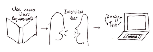
I had only one day to produce an MVP. This one day included understanding the use cases, determining who the users were, speaking with an internal user, and producing mockups.
I wanted to understand the following:
- How is this new product different from our existing platform?
- Where does this product fit in the market?
- Why is this user interested in our database product instead of our Anzo platform? How are these users’ needs different?
- What information did the user need to view simultaneously?
- What actions did the user want to perform in succession?
I learned that these database users were typically advocates for graph technology and wanted to use our database front-end UI to get a feel for running queries (i.e. lines of code) against the database. Most of the time, users were going to run these queries and download the code and results. However, more technical users would be in charge of actually managing the database. These users would focus on topics such as, was the database big enough for the amount of data the company has?
Design Decisions and Mockups
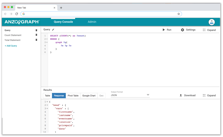
Based on learning about our two different user types: users who wanted to experiment with queries and users focused on database administration, I divided the UI into two high level sections: Query Console and Admin.
One of the requirements for the Query Console design was that it had to be based on the YASGUI widget. With only one day to product a design proposal, my goals for adapting this widget were to keep the interface consistent with the Anzo UI styling, make it simple and flexible because it was the initial foundation for future functionality, and make it scalable to many queries. In order to make the amount of queries more scalable, I moved the list of queries from growing horizontally across the screen to grow vertically down the screen. To adapt the style to match the Anzo design library, I added text next to all button icons, except for edit. Lastly, I worked with our internal user to get rid of any irrelevant information (such as the URL).
When working on the Admin section, I divided the UI into four main sections: General, Graphs, Queries, and Diagnostics. Again, my main goals were to keep the style of the UI consistent with the Anzo UI and to keep it simple to expand upon later.
